

Introducing Taily UI - 🚀 Beautiful, fast, and modern UI Library 100% built and animated with pure Tailwind CSS.


- Taily UI
- 🎨 Pure Tailwind CSS - No extra CSS files or dependencies to load
- ⚡ Lightweight & Fast - Minimal bundle size with zero overhead
- 🔧 Fully Customizable - Use Tailwind utilities to style components
- 📱 Responsive by Default - Mobile-first design patterns
- ♿ Accessible - Built with accessibility best practices
- 🎯 Simple Data Attributes - Easy-to-use HTML interface
The fastest way to get started with Taily UI is to use the data attributes interface:
<!DOCTYPE html>
<html>
<head>
    <script src="https://cdn.tailwindcss.com"></script>
</head>
<body>
    <button data-color="primary" data-type="solid" data-size="medium" class="button">
        Start using Taily UI
    </button>
</body>
</html>
For a complete setup guide, check the Installation section below.
Before you begin, make sure you have:
- Node.js 14.0 or higher (Download)
- Tailwind CSS 3.0 or higher (Install Guide)
Taily UI can be included as a plugin into an existing Tailwind CSS project to help you build websites faster with a set of beautiful, production-ready web components built with Tailwind CSS utilities.
Make sure that you have Node.js and Tailwind CSS installed first.
-
Install Taily UI as a dependency:
npm install taily-ui
-
Add Taily UI as a plugin in your
tailwind.config.js:const { tailyUI } = require('taily-ui') module.exports = { plugins: [tailyUI] }
-
Or if you use TypeScript, add it to your
tailwind.config.ts:import type { Config } from 'tailwindcss' import { tailyUI } from 'taily-ui' const config: Config = { plugins: [tailyUI] } export default config
The preferred way to use Taily UI components is via the data attributes interface. This allows you to configure components directly in your HTML using simple attributes:
<button data-color="primary" data-type="solid" data-size="medium" class="button">
    Start using Taily UI
</button>
Available attributes include:
data-color- Set the button color (primary, secondary, default, etc.)data-type- Choose the button type (solid, outline, ghost, etc.)data-size- Define the button size (small, medium, large, etc.)
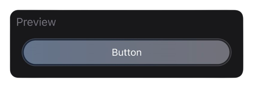
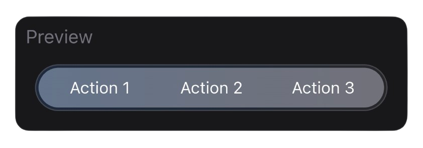
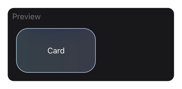
Taily UI is an open source collection of 50+ UI components built with the utility classes from Tailwind CSS that you can use as a starting point when coding user interfaces and websites. Each component is production-ready, fully customizable, and accessible.
| Button | Button Group | Card |
|---|---|---|
 |
 |
 |
Make sure Taily UI is correctly installed as a plugin in your tailwind.config.js or tailwind.config.ts file. The plugin needs to be included in the plugins array for styles to be generated.
Ensure that:
- Tailwind CSS version 3.0 or higher is installed
- You've included the Taily UI plugin in your Tailwind config
- You're using the correct data attributes
For more help, check the documentation or open an issue on GitHub.
Contributions, issues, and feature requests are welcome! Feel free to check the issues page.
-
Fork the Project
-
Create your Feature Branch
git checkout -b feature/AmazingFeature
-
Commit your Changes
git commit -m 'Add some AmazingFeature' -
Push to the Branch
git push origin feature/AmazingFeature
-
Open a Pull Request
This project is licensed under the MIT License - see the LICENSE file for details.